MAKING OF: Antwon Spinach Intro
Shortly after finishing the latest 2nd Avenue episode, we were asked to assist in bringing to life a cartoon series called Antwon Spinach. Specifically, we were asked to design the main cast of characters and produce a 45 second intro.
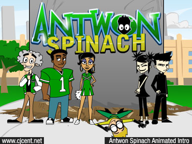
Before we could start designing anything, we needed to get a good understanding of Antwon’s world. Stix (songwriter, performer, as well as the series creator and writer) had a very clear vision of what he was looking for, which made the preproduction process flow smoothly. He also produced the incredible intro song that inspired the entire idea for the intro. After fully wrapping our minds around the world of Antwon, we started designing the characters.
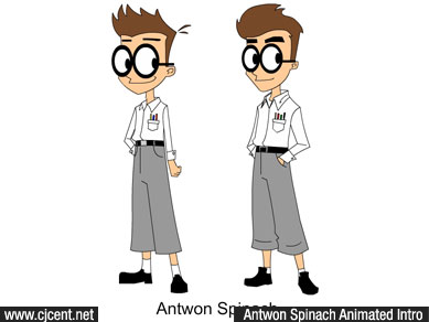
The art style was inspired by Butch Hartman; creator of many popular cartoons like Dexter’s Laboratory, Johnny Bravo, Danny Phantom, Fairly Odd Parents, and many more. Hartman’s basic shaped art style is what Stix had envisioned for his characters. While keeping that in mind, we developed the main cast.
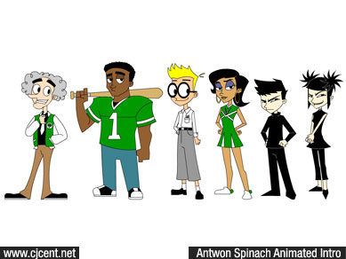
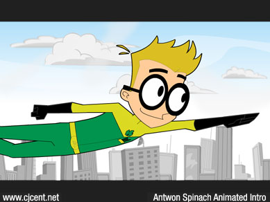
We’re very proud of our accomplishments with this project. As usual, we ventured into new territory and challenged ourselves to do more than we originally thought we were capable of. With that in mind, this was our very first project that we attempted to produce in the HD format, and this was also our very first After Effects compiled project!
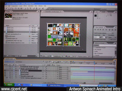
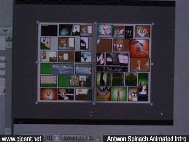
The characters were animated in Flash and exported out as high resolution PNG sequences. We later took those sequences and imported them into After Effects where we did the rest of the work. The thought of using After Effects as our primary tool was a bit scary in the beginning. Theoretically we had everything mapped out, but being so unfamiliar with After Effects made us very unsure of the outcome. In the end, everything worked out beautifully.
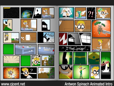
We designed a two page comic book with a bunch of empty panels, and used the provided script to map out where the animation would go. This was a very delicate process because everything had to match up perfectly. Each panel held a large significance, and we had to make sure that everything was perfectly placed in order to get the most out of that segment.
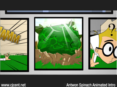
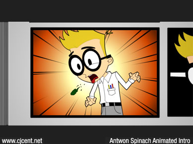
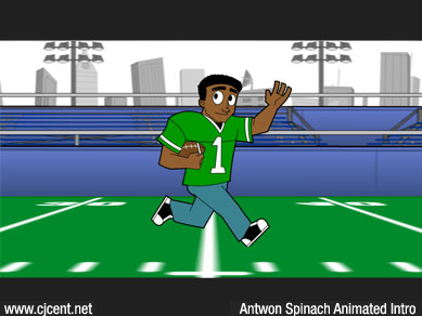
Overall, the comic book segment proved to be the most challenging since that’s where we had to rely so heavily on After Effects. The second most challenging part was the football field scene where the camera zooms out from each character. We used After Effects to create a ground that the characters would actually stand on in 3D space. Then we used a camera to zoom out from each character. While this was very challenging for us to accomplish, it was still a lot easier than our alternative plan of trying of achieve the same results in Flash by scaling the characters and background while trying to maintain that sense of perspective and depth.
This was a very interesting project to work on, to say the least. We’ve had our ups and downs with it, but for the most part everything went pretty smoothly. The knowledge gained from this experience will definitely help us on our current and future projects.