CJC News
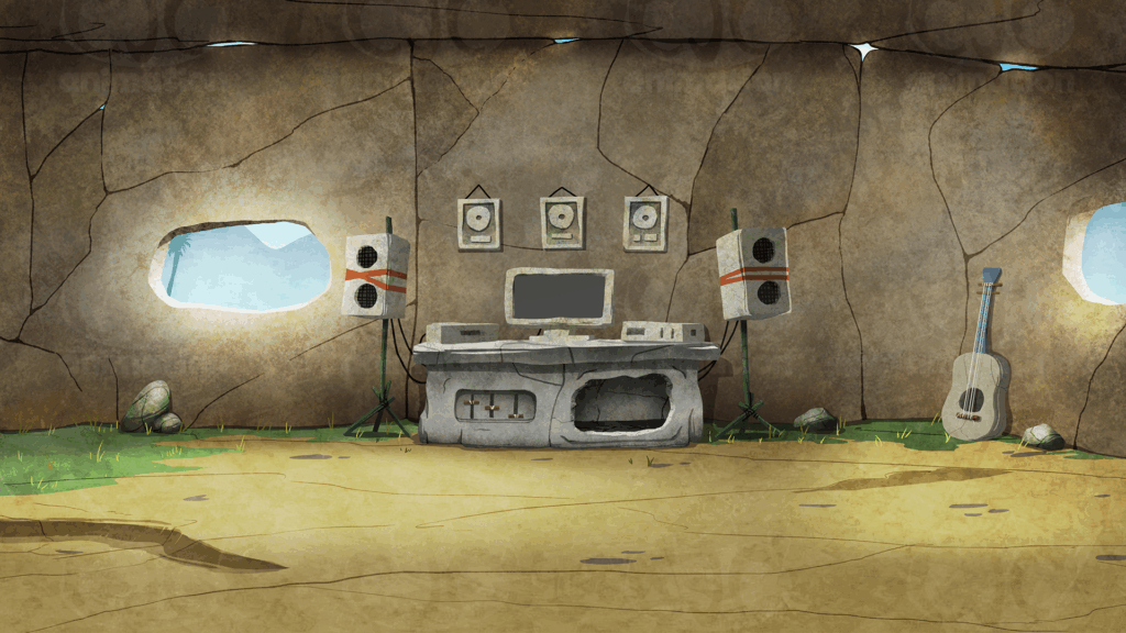
KumBaYah is an app (available on iOS) that streamlines the process of music ownership and management. It offers the ability to quickly and easily create split sheets and conveniently keep all collaborators in the loop. It can be a useful tool for those in the music industry.
The idea behind the animation is to demonstrate how the split process would typically go since the caveman days. The idea was written and directed by KumBaYah’s creative director, so it was our job to bring that vision to life. It was a fun project to work on!
The animation was created using a combination of Adobe Animate and After Effects. This project is very old at this point, but due to our hiatus, we never got the chance to share the full animation. You can check it out below:
To learn more about the KumBaYah app, check it out in the App Store: https://apps.apple.com/us/app/kumbayah-digital-song-splits/id1592844020
After completing the Look At Me Now lyric video, we were invited to work on another project with a similar visual style. This time, it was for IRIE (a single set for release) and the goal was to build hype ahead of the drop.

Our task? Take a few seconds of the song and create a dynamic teaser with the same high-energy, effects-driven approach as the lyric video.
Having learned a lot from our previous project, this one went much smoother. Not only were we able to work faster, but we also had the chance to experiment with new ideas. It was a fun challenge that pushed our creativity even further.
Together with the creative director, we decided to focus on the song’s opening and hook. We let the music guide us, just as we did before, and a concept quickly took shape. After a few minor revisions, the final result was locked in.
Check it out the teasers below:
You can find IRIE on all streaming platforms by searching Irie Bless Man.
A lyric video is something we never imagined ourselves working on, but when we were asked if we’d be willing to take a shot at making one, we couldn’t resist the challenge. Pushing ourselves outside of our comfort zone and trying new things has always been part of our creative journey. So, we signed on.
From the start, we weren’t sure what to expect. There was a steep learning curve, but we wouldn’t stop until everyone was happy with the final product. We didn’t know how to conceptualize or storyboard for this, and our traditional methods didn’t quite click with this format. Instead of overthinking, we decided to freestyle the entire process, fully aware that it wasn’t the most efficient approach. Every scene was built as we went, adapting and adjusting along the way. We let the music guide us, feeling the vibe from listening and translating it into something visual. The effects were a blend of our traditional animation techniques and heavy use of After Effects.
The song, “Look At Me Now,” hasn’t been released yet, but we were given special permission to share a 60-second preview of the video. Choosing which part to showcase was no easy task. There were so many moments we were proud of. Ultimately, we landed on a section that highlights both the rap segment and the hook, which felt like the perfect representation of what we accomplished.
Check it out here:
We’ll be sure to share the full video once it’s officially released!
This project was one of the most challenging we’ve ever worked on, but also one of the most rewarding. The artist and producers were beyond happy with the final result. In fact, they loved it so much that they invited us back to work on another project of the same nature. More on that soon!
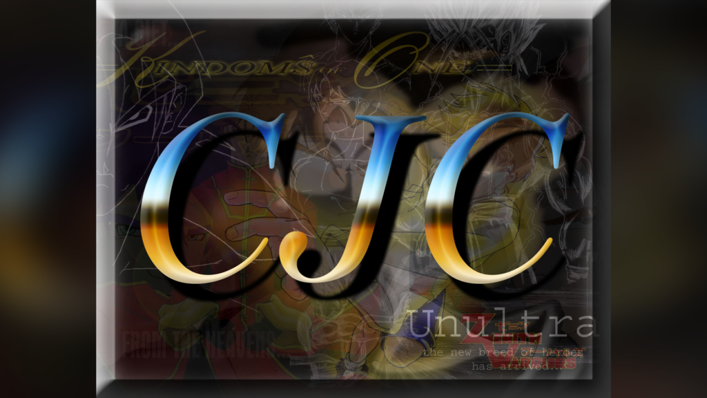
An artistic collage we created purely for fun in September 2003. Long before we realized ‘CJC’ would one day become the name of our company.
This month marks a major milestone for us. In January 2005, we took the first steps towards turning our passion into a career. It all began as an outlet for our creativity, and over time, grown into something we never could have imagined. It’s been an incredible journey, full of ups and downs, but with new lessons learned at every turn.
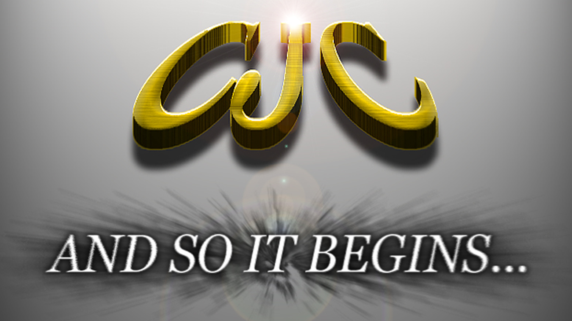
An image we created in November 2004 to tease the launch of our company, marking the beginning of an exciting new chapter.
The Beginning
In 2003, the owner of a limousine service approached us with a request to create promotional images for their company. It was the first time we had the opportunity to offer our services professionally, marking the beginning of our freelance journey. From that moment on, we never looked back, taking on small projects, honing our craft, and learning the ins and outs of running a creative business.
By January 2005, we took the plunge, officially registering our business as CJC Entertainment. Our vision was broad, encompassing art, graphic design, logo creation, website design, and animation. We were brimming with ideas and eager to explore every avenue we could.
Our first official logo for CJC Entertainment, created in February 2005 to brand our animated series 2nd Avenue. It served as our identity for the first two years.
Challenges and Milestones
Over the years, our journey has been anything but smooth, filled with sleepless nights, doubts, frustrations, disappointments, and heartbreak. The emotional toll was often high, and we faced our fair share of challenges. But every experience taught us valuable lessons that helped shape who we are today.
Our redesigned logo from May 2006. The logo that became synonymous with us during our rise in popularity. This design represented us for the next four years.
20 Years of Gratitude
We’ve had the privilege of collaborating with incredible individuals from all walks of life, bringing a wide variety of creative visions to life. From developing brand identities to producing fully animated films, each project has been a stepping stone in our journey. Along the way, we’ve also had the chance to work on our own in-house projects, including an animated series that remains close to our hearts.
Our revised logo from July 2010. A fine-tuned, enhanced version of the previous design that gave it a polished, modern look.
Looking Ahead
One of our most significant pivots came in 2017 when we rebranded as CJC Animation, shifting our focus to the work that resonated most with us… visual storytelling. This renewed focus not only reignited our passion but also set the stage for some of our most rewarding projects.
Looking ahead, we’re excited about what the future holds and can’t wait to share the projects we’ve been working on behind the scenes. Here’s to continuing to create, inspire, and grow in the years to come.
Our rebranded logo for CJC Animation, introduced in July 2017 and proudly representing us to this day.
Thank You
As we celebrate two decades, we’re filled with gratitude for everyone who’s been part of our journey, our clients, collaborators, and supporters. Your encouragement and trust have been invaluable.
To our fellow creatives, clients, and friends: thank you for being part of this journey. Here’s to another 20 years of storytelling, innovation, and pushing the boundaries of imagination.
Hello! Remember us? No? Totally fair. It has been a while.
After a long hiatus, we’re finally finding our footing and getting back into the groove. The last time you saw us was late 2019, and then 2020 arrived… well, you know how that story goes. The pandemic threw us into a whirlwind of challenges, leading to a few tough years. But here we are, stronger, and ready to share everything we’ve been working on behind the scenes.
Big changes are coming! We’ve taken your feedback to heart and are rolling out updates to our website (dark mode, anyone?). Plus, we’ve got some exciting announcements on the horizon, so stay tuned!
We’re thrilled to reconnect and can’t wait to show you what we’ve been up to. Thanks for sticking with us. We’ve missed you!